Collage illustration in black and pink tones showing bold branding elements and a paint roller revealing a list of complex numbers.

CASE STUDY

Reinventing Good-Loop's carbon measurement platform:
a complete product redesign

MY ROLE

In-house product designer

User research | UX | UI | Stakeholder collaboration

View PDF →

BITESIZE SUMMARY

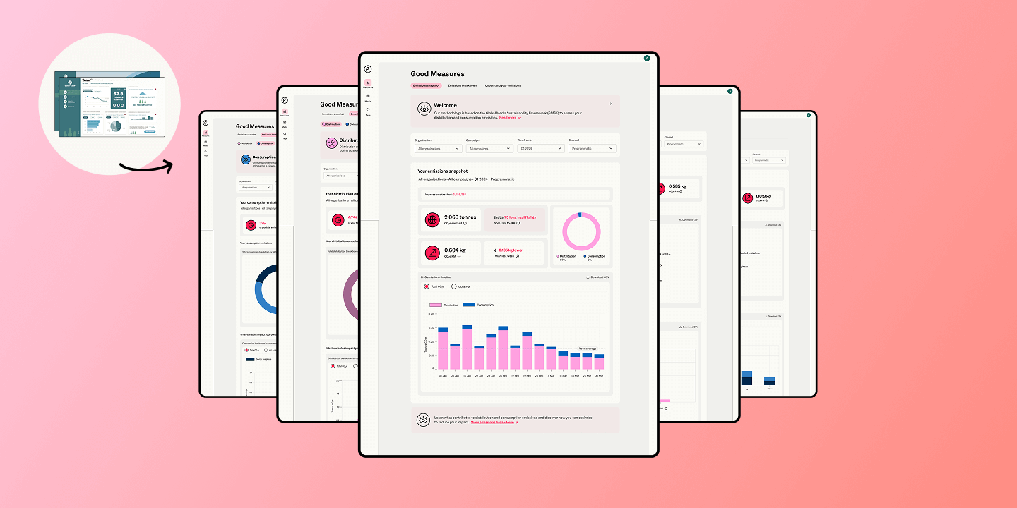
A redesigned carbon monitoring dashboard for advertisers, built from the ground up to align with Good-Loop's high-impact company rebrand and a new, industry-wide emissions methodology.

My challenge: translating complex data and bold branding into a focused dashboard

PROCESS HIGHLIGHTS

Shows dashboard design iteration. Left shows early version with bright red data visualisations and a user quote reading  'this hurts my eyes' and right shows refined interface plus pink and blue colour swatches and a user quote reading 'So easy to follow with the colour-coded sections!'

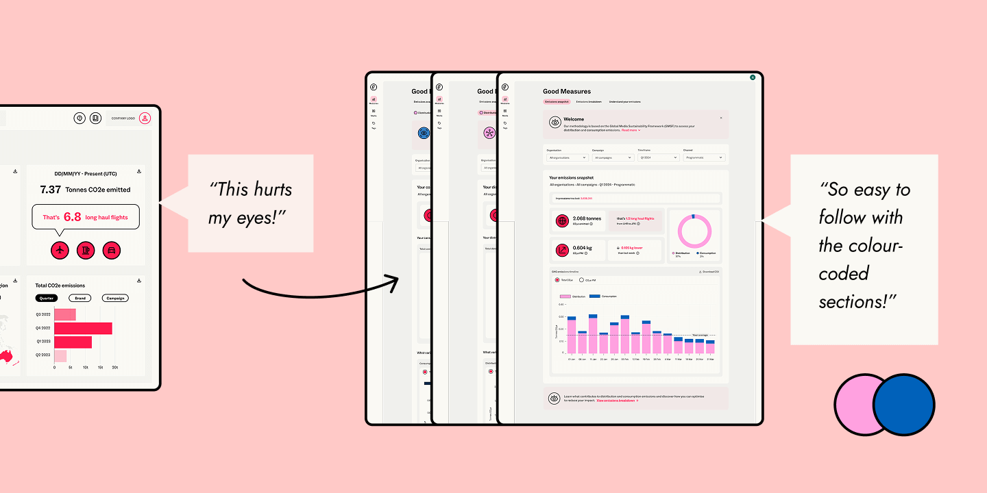
User interviews revealed a shared need: the design had to be educational yet easy to grasp. Iteration and testing honed a visual language that used brand colours to guide users through complex data.

To support accessibility, I included text and icons to ensure that understanding of data was not reliant on colour alone

OUTCOME

Collection of overlapping dashboard interface screens showing various views and states of the final design system. The dashboard's background colour palette is pale grey, off-white and soft pink. Data is visualised in blue and pink.

The redesigned dashboard brings brand and data together, delivering clarity for two distinct types of users: Agency Decision-makers needing a big-picture view, and Campaign Analysts diving into the details.

Easy to use, with clearly presented data and a design that feels modern

— CARLA, CAMPAIGN ANALYST
READ THE FULL CASE STUDY (PDF) →

PREVIOUS CASE STUDY

Earth illustration with digital advertising icons

Designing Good-Loop's first carbon measurement platform:
from what if to action

View case study →