BITESIZE SUMMARY
A carbon monitoring dashboard to help brands understand the hidden cost of their digital advertising. Designed from the ground up for tech-for-good startup, Good-Loop.
My challenge: shaping an early vision into a tangible, launch-ready design
PROCESS HIGHLIGHTS
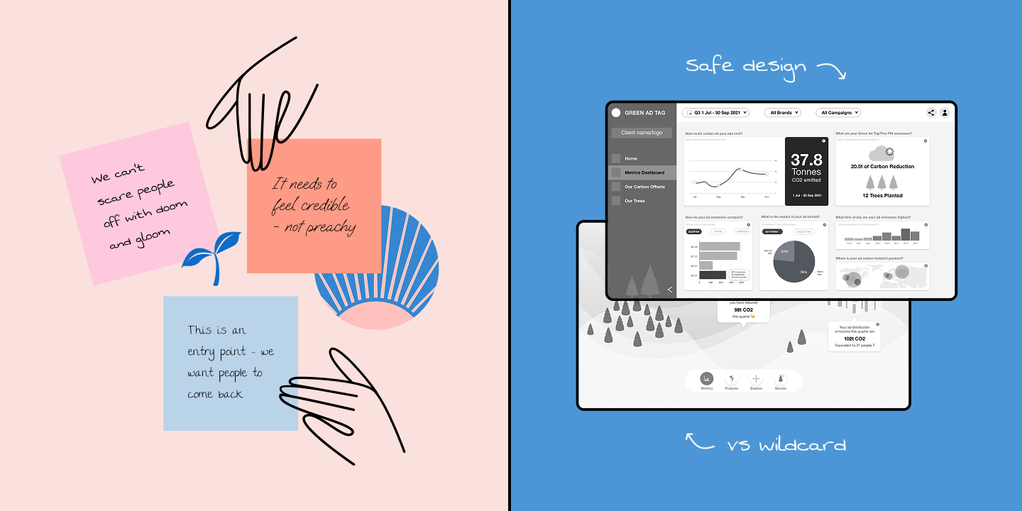
Workshops distilled possibilities and united stakeholders around a core goal: the dashboard and its data had to feel approachable. Interactive prototypes then brought ideas to life and clarified design direction.

Creating both a 'safe' and a 'wildcard' prototype helped inject creativity into my design process without losing focus on core data deliverables.
OUTCOME
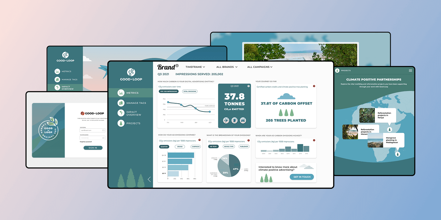
The final design provided advertisers with a window into their digital emissions, giving them data that was easy to access and digest - a first and vital step towards reducing their carbon footprint.
I use a lot of dashboards in my role and this is one of the easiest to use
— ZAC, MEDIA AGENCY HEAD
READ THE FULL CASE STUDY (PDF) →